We have a gift for you if you Subscribe to our email :)
First Impressions Falling Flat? Design an NFC Card That Wows Every Time
Your digital business card isn’t just a utility—it’s a branding tool. In this blog, we break down the art and science behind designing an NFC card that makes a strong and lasting impression. From aesthetic elements like typography, color schemes, and animation to functional features like embedded videos and interactive buttons, you’ll learn how to create a card that not only looks good but performs brilliantly. Backed by UX research and A/B testing insights, this guide helps you turn a simple tech asset into a storytelling medium. Whether you’re in tech, fashion, real estate, or freelance creative work, this post offers inspiration and frameworks for designing an NFC experience that represents you at your best.
NFC TECHNOLOGYMARKETING MATERIALSDESIGN & UXBRAND STRATEGYPROFESSIONAL NETWORKING
NFC Philippines
4/2/20252 min read

Introduction
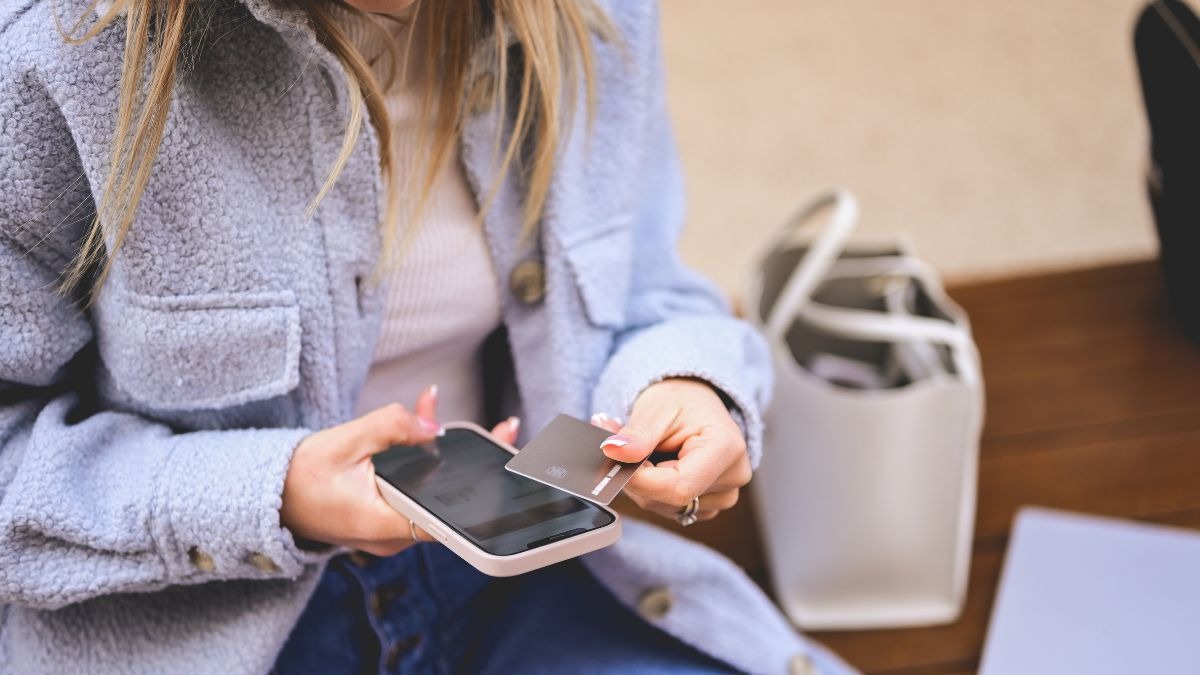
Why Your NFC Card Is More Than Just a Card You wouldn’t go to an investor meeting in a wrinkled suit. So why hand out a digital card that looks and feels like an afterthought? Your NFC card isn’t just about transferring contact info—it’s often the first branded interaction someone has with you. And in networking, first impressions matter more than ever.
In today’s fast-paced digital world, design is the new credibility. Your card should reflect the same level of care, clarity, and creativity you bring to your business. This post explores exactly how to design an NFC card that grabs attention and leaves a memorable mark.
The Power of Good Design:
UX Meets Identity User experience (UX) design isn’t limited to apps and websites. It applies directly to your digital business card. Here’s how:
Clear visual hierarchy ensures your name, role, and CTA are immediately visible
Clean design makes navigation intuitive—buttons must be large enough, and fonts legible
Accessibility matters: ensure good color contrast, alt text for visuals, and responsive design
According to the UX Collective 2023 Report, users are 22% more likely to engage with a card that has visual balance, appropriate white space, and a structured layout.
Design Elements That Elevate Your NFC Card
High-Quality Branding
Use a crisp logo and your brand’s official colors
Maintain consistency with your website and social media assets
Interactive Features
Add a video intro or elevator pitch
Include testimonial snippets or dynamic carousels of your work
Clear CTAs
Use button labels like “Schedule a Call,” “Visit Portfolio,” or “Follow on LinkedIn”
Mobile-First Optimization
Ensure your design adapts to various screen sizes
Optimize for speed—pages should load in under 2 seconds
A/B Testing for Design Success Your first design might not be the best one. Run A/B tests on:
Button placement and labeling
Use of video vs. static imagery
Color schemes for emotional impact
Tools like Carrd, Koji, and Linktree Pro offer basic analytics that help you iterate based on real user behavior.
Case Example:
A Designer’s Edge A freelance UI/UX designer created an NFC card that linked to an interactive mobile portfolio. Compared to their static website card, the NFC version:
Increased client inquiries by 48%
Generated 2x more LinkedIn connections
Earned compliments from 70% of new contacts at conferences
Conclusion
Design for the Moment That Matters In the era of digital first impressions, your NFC card is your elevator pitch. The right design can make the difference between a fleeting glance and a meaningful connection. Whether you’re a creative or a consultant, your card should reflect your value from the very first tap. Make it thoughtful. Make it beautiful. Make it unforgettable.
Contacts
CustomerSupport@nfcphilippines.com
+63 945 319 7429 SMS, WhatsApp, Viber.
Raya Garden Condominiums, Parañaque, Philippines